5 Website Design Tips for a Website That Wows
1. Inspire people to scroll and click
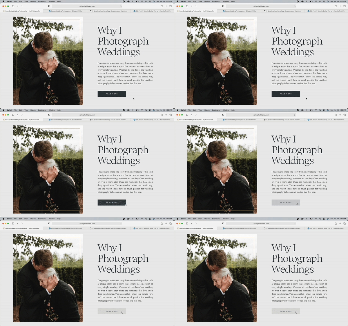
Professional websites don’t have to be boring. Make your website interactive and fun! I love it when something changes colour as my mouse hovers over it or when something moves as I scroll. (Yes, this is my idea of fun lol). A website that responds to me, keeps my attention and makes me want to explore more.
*In case you’re thinking that adding a soundtrack to your website might be fun—please don’t! This can be annoying and overstimulating. Focus on making your website a visual masterpiece instead.
2. Design Your Website with Visual Hierarchy in Mind
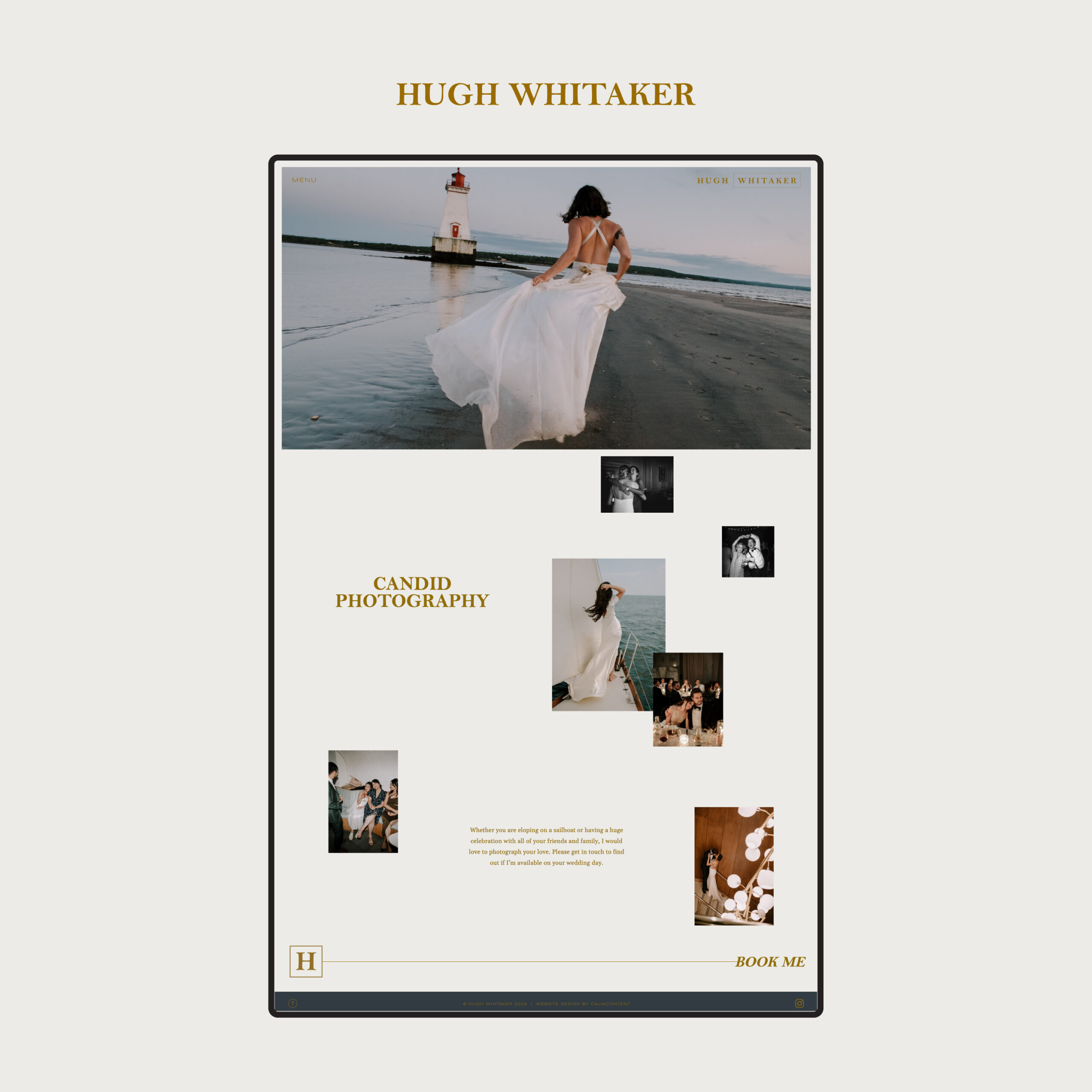
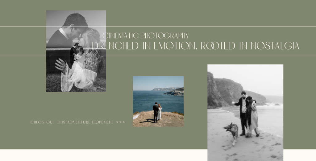
Visual hierarchy is a design principle that tells the viewer in what order to look at things. In a photo, if everything is in focus, it can look kind of flat, right? Similarly, if all of the text on your home page is the same size, there’s no depth and nothing pops. Visual hierarchy helps showcase content in a way that is clear and impactful. When you use visual hierarchy well, you’ll make your website more digestible. Visual hierarchy guides website visitors’ attention to certain webpage elements in order of priority, starting with the most important. When it comes to website design, these are the most important pieces of visual hierarchy:
Size and Scale
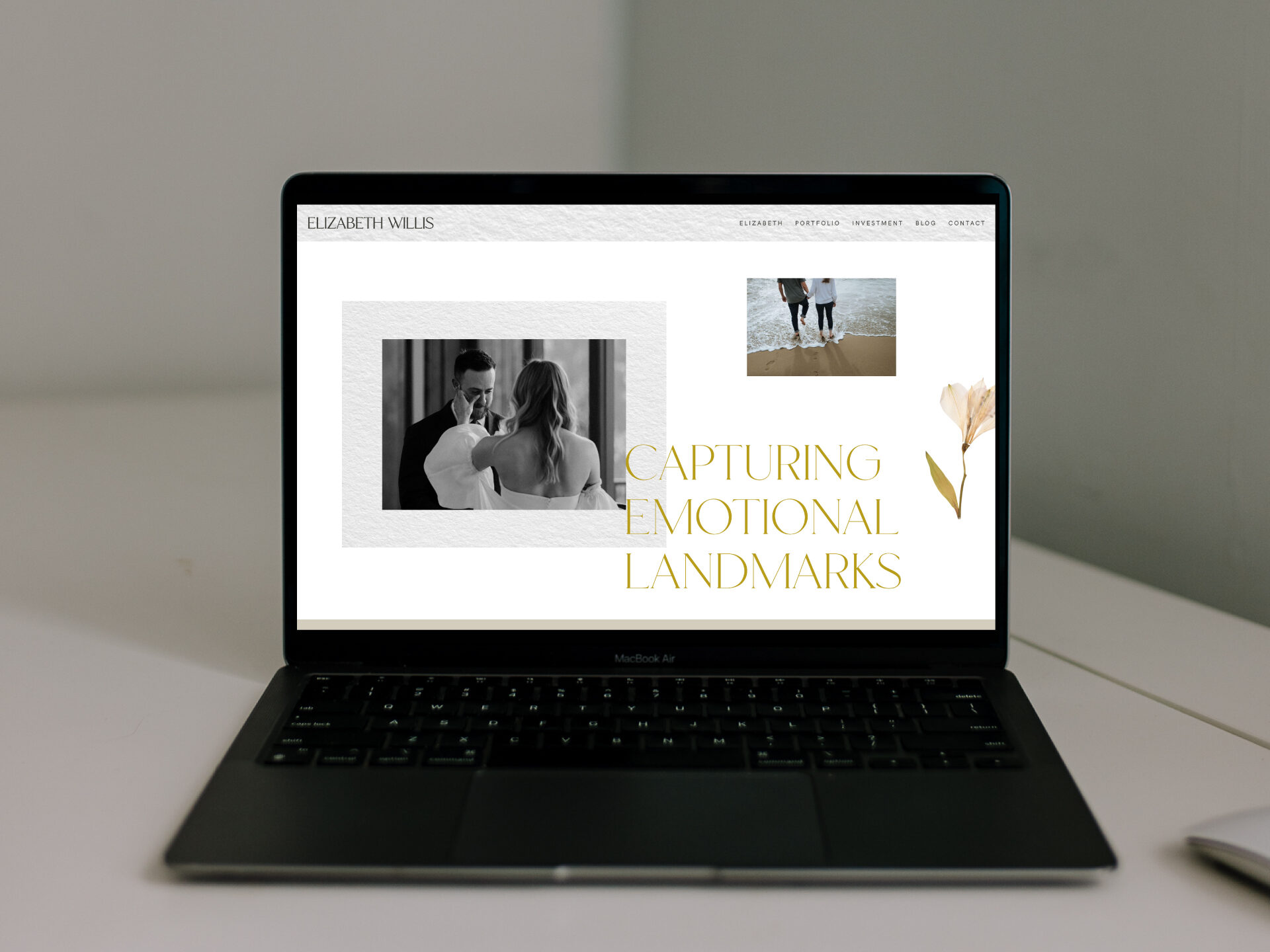
Notice how this subheading is smaller than the one above? That’s because it’s less important. Highlight the most important parts of your home page, like a heading or your logo, by making it larger and more visually prominent than your navigation buttons for example. Website visitors will naturally gravitate towards large and bold titles first, and only then move on to subheadings and smaller paragraph text. It’s all relative, so play with different sizes until it feels right.
Spacing and Alignment
Just because you have space, doesn’t mean you need to fill it. Blank space can help an important photo, message or call-to-action really stand out.
Rule of Odds
An odd number of elements (products, images, subheadings, etc) has been found to create a more interesting and visually pleasing composition. Not sure how to arrange your blog posts? Try a row of 3.
Colour and Contrast
Not really sure how to implement your brand colours? Your brand designer likely gave you a selection of brand colours, including primary and secondary colours. Lean into your primary colours. Give your secondary colours just a light sprinkling throughout your website. Perhaps you make your buttons turn blue on hover only. Primary colours need to be omnipresent. Secondary colours need to pop every once in a while.
3. Make your Website Flow
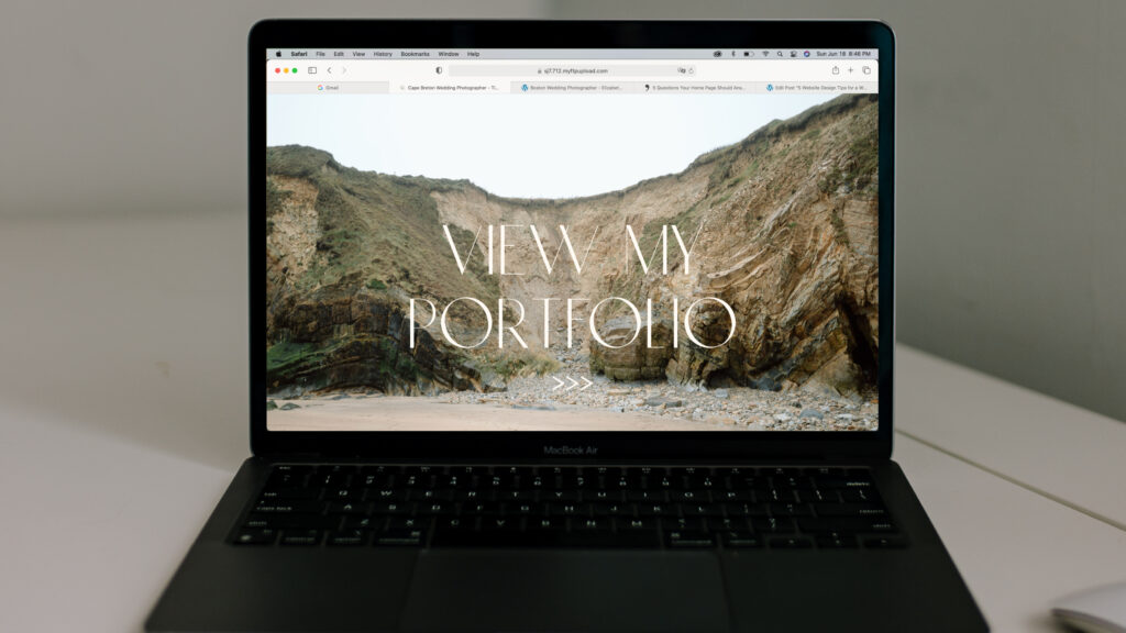
Guide people through your website with calls to action that link them to the next place you want them to go. Less is more. Give people fewer calls to action so they don’t have to stop and think about it. Make the decision about where to click next super easy.
DO: Educate people about who you are, how you can serve them, etc., Then put a very clear call to action below that.
DON’T: Put a call-to-action to book now at the very top of your home page. The viewer isn’t ready yet. You’ve gotta romance them and give them the reasons to book you first. Guide them to your portfolio first, then invite them to book you.
DO: Put a few calls-to-action on your home page. Invite the viewer to get to know you and what you have to offer.
DON’T: Put a link to every single thing on your website on your home page. It’s overwhelming and if people have to pause to make a decision, you’ve lost them and they’re likely to leave your website.
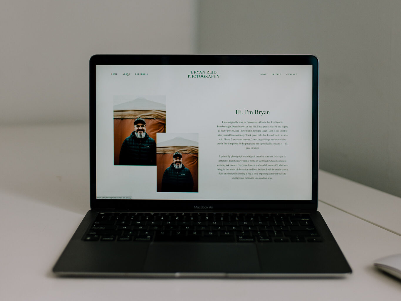
DO: Put links to every important page of your website in your main navigation in your website header and/or footer so that if people are looking for something specific, they can very easily find it.
DON’T: Rather than having a menu with 8+ links across the top of your website, organize them by category and have some dropdown menus so that it’s not too overwhelming. Put your Investment, FAQ and your Process pages all under an Info tab that drops down.
4. Write Content that is Easy to Read
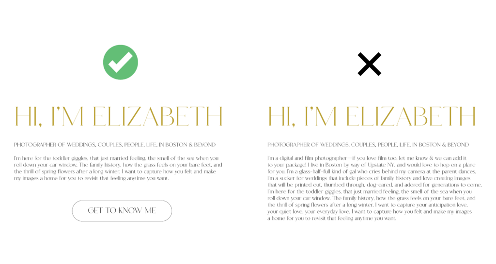
- Make your home page minimal. Your home page is like a teaser—tell the viewer just enough to pique their interest. They will click to read more if they’re intrigued by something.
- In a world that has an increasingly short attention span, a long paragraph can be overwhelming and left unread. Keep sentences short and simple.
- I love a numbered list. Obviously ; ) This is a great way to break up a big chunk of information that you need to get across, in a way that makes it more consumable and memorable.
- If you’re a particularly wordy person (like a 19 pages, front and back kind of person), write blog posts!
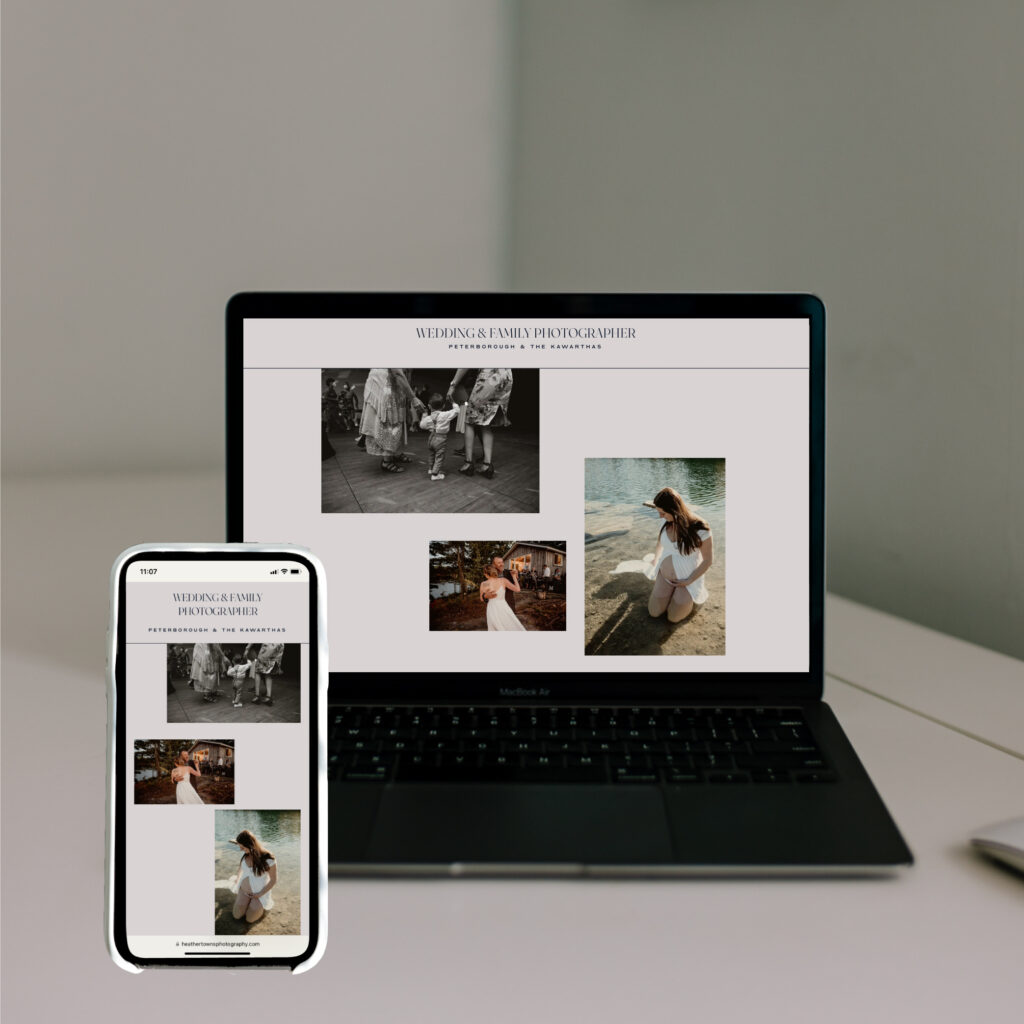
5. Design your Website Specifically for Mobile
The majority of people will likely visit your website from their phone. Your mobile layout can’t be an afterthought. Design the mobile version of your site with 16:9 compositions that fill your phone screen. Use full screen images. It may even make sense to leave some design elements out of your mobile layout if they don’t fit as well as they do in your desktop design.
If you’re a creative and you want to level-up your business with a website that impresses, I’d love to design a new website for you! Please reach out to me here and tell me a little bit about your business.
©2025 CALMCONTENT
