Fonts I Love
Here is a collection of fonts I love in 2024. You can download most of them for free or for a reasonable fee on Creative Market. I hope you enjoy nerding out on fonts with me.
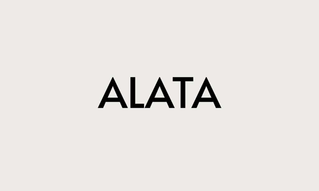
Alata. A thick, minimal sans-serif font. Simple, but stylish. I love the contrast of hard angles and rounded edges. I also appreciate the consistent line thickness that this font boasts throughout the entire alphabet.
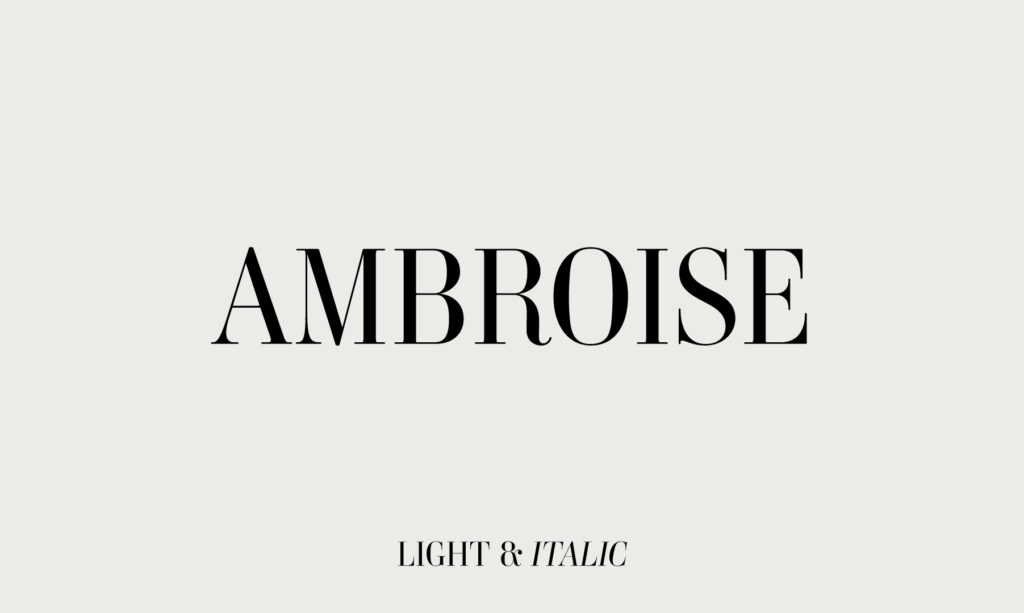
Ambroise. A very classy, timeless serif font. It’s fashion-forward, but without being trendy. Comes in various thicknesses, from light to bold, as well as italic. I’m obsessed with the R.
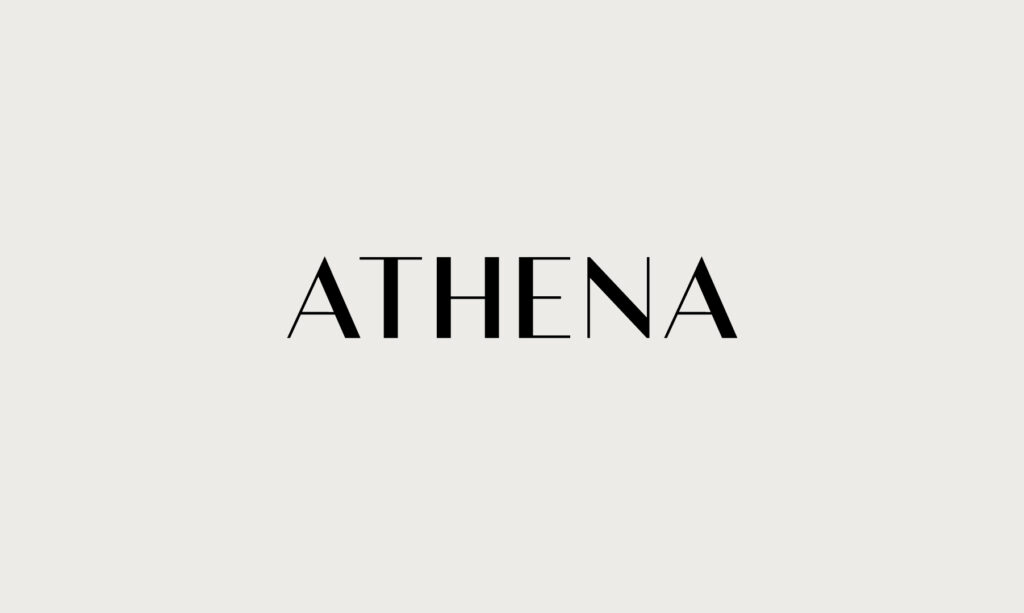
Athena. A classy, balanced sans serif font with variable line thicknesses throughout. It’s the perfect combination of bold and minimal to make a statement.
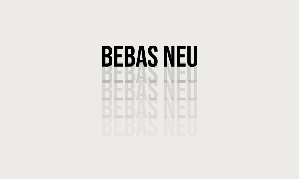
A bold, narrow and sans serif all-caps font. I love the Bebas Neu font for headings and logos. If you want something to be punchy that stands out, this iconic font is for you.
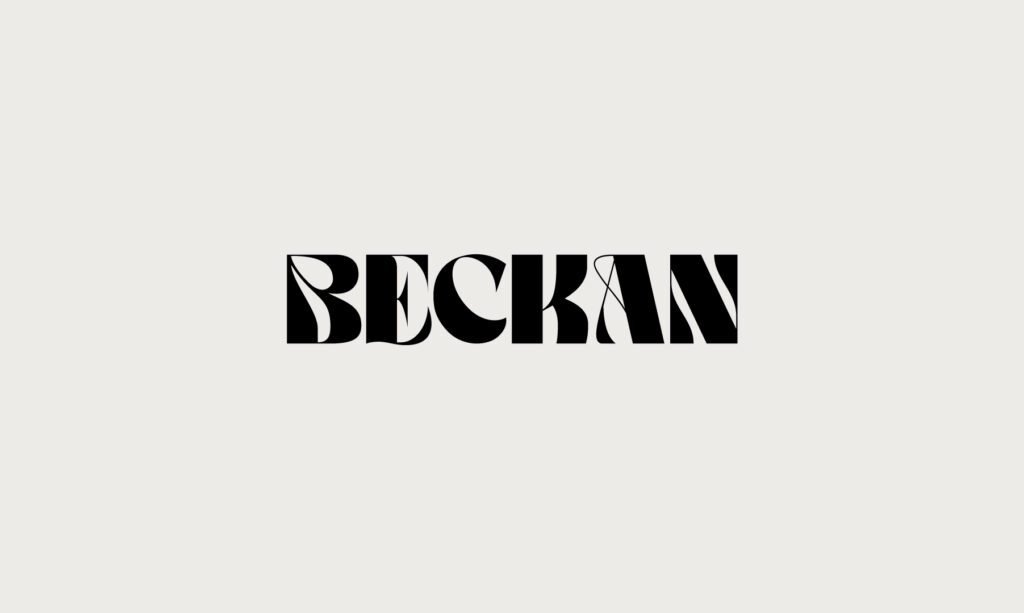
Beckan is soooo groovy and 70s, but with a modern twist. It’s like if bell-bottoms were a font.
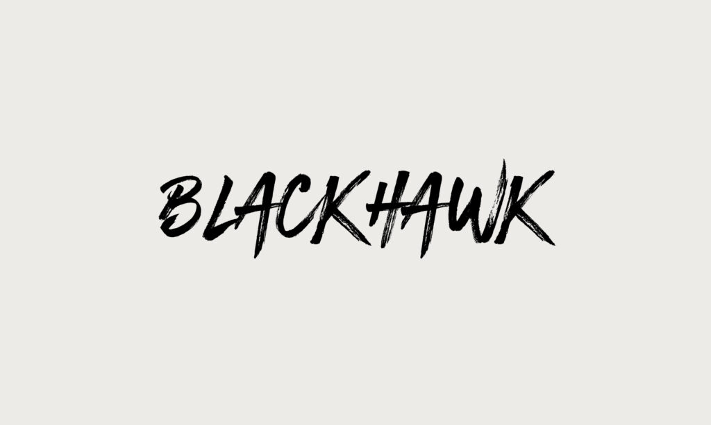
BlackHawk. Bold and edgy, with a hand-painted, artistic feel. Reminds me of the Lush logo.
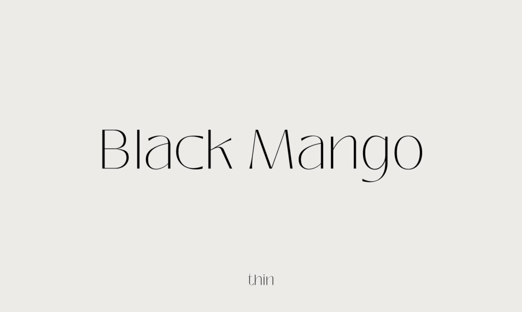
Black Mango. A modern and feminine font.
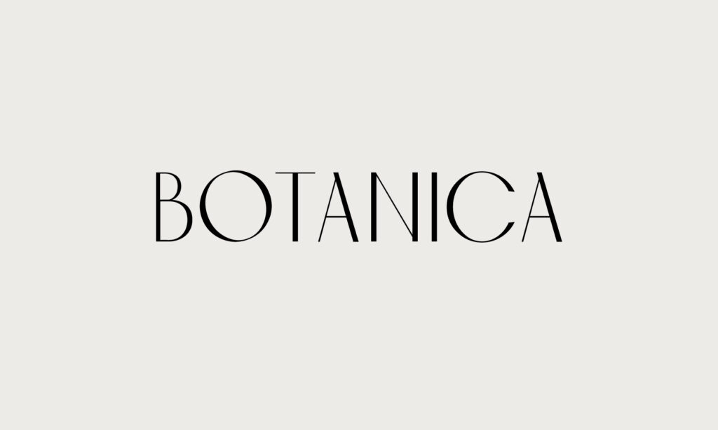
Botanica. A modern all-caps font. Sturdy, but delicate. This font feels like Tulum to me.
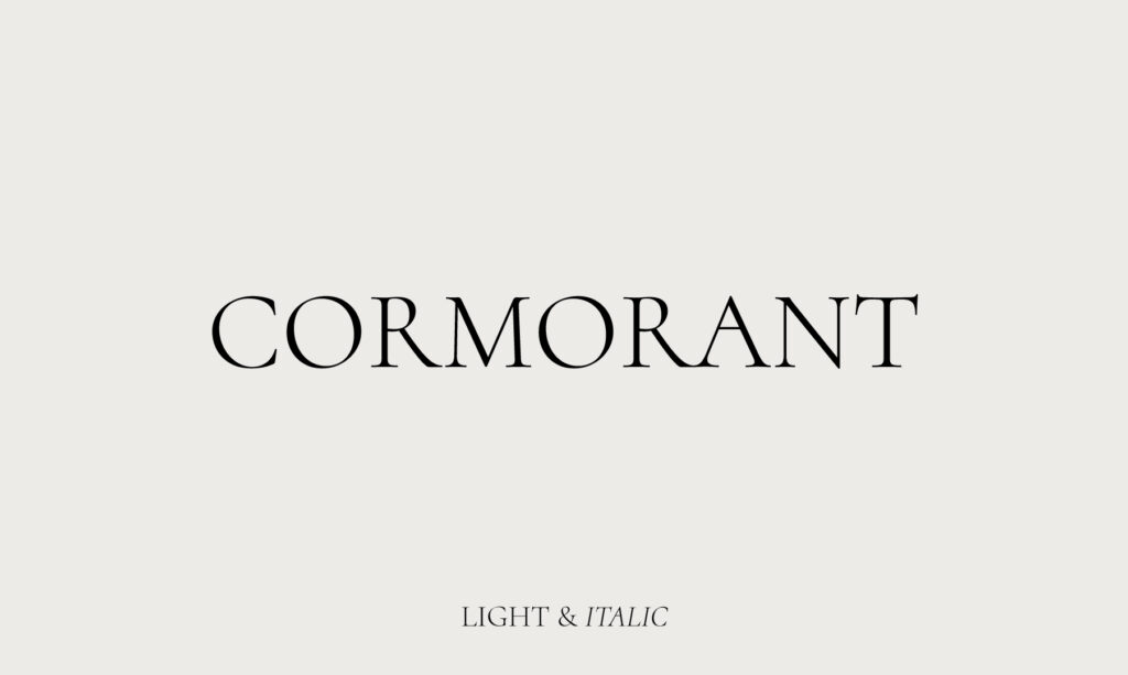
Cormorant. My go-to serif font for mixing regular and italics. I like it in all-caps, but it’s a classic font that comes in all sorts of styles.
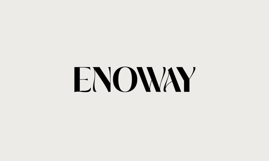
Enoway. A trendy, bold and wavy font. Feels like liquid.
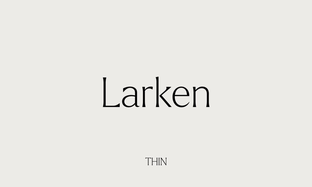
Larken Thin. I can’t decide if I like it more in all-caps or regular case. This font feels youthful to me.
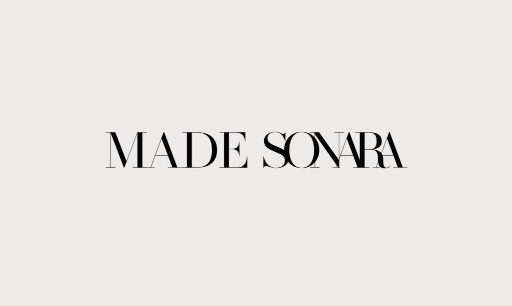
This classy serif font is straight out of a fashion magazine. It’s very similar to the Vogue font and it exclaims class & style in a sophisticated voice. I feel like this font is never going out of style. If you’re looking for a timeless, editorial font, this is it.
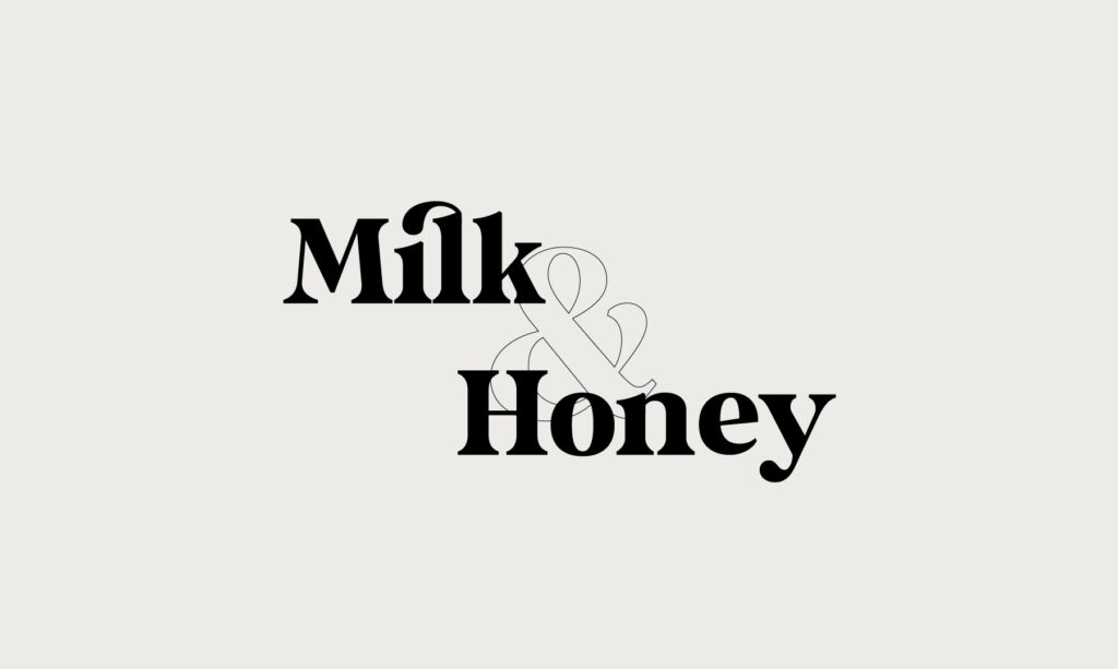
Milk & Honey is a bold serif font. It’s retro with some quirky letters. I love playing with this font as an outline like I did here with the ampersand.
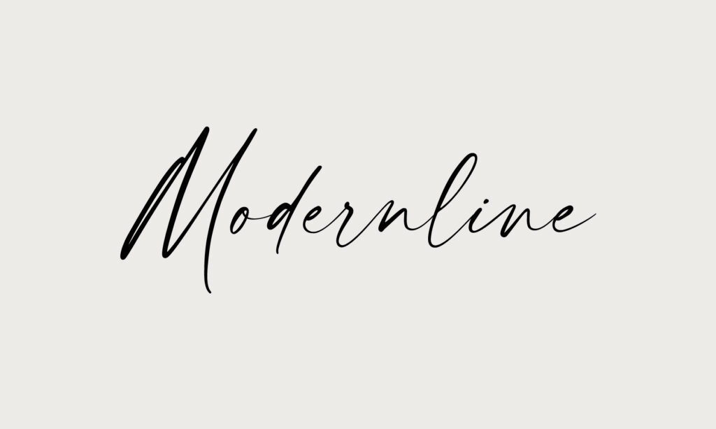
I don’t use hand-written script fonts very often, but when I do, Modernline is my go-to! It’s not too frilly. It feels organic, but modern and mature.
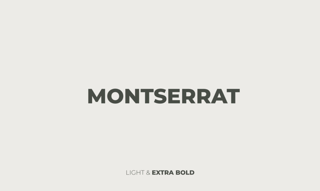
Montserrat forever! Minimal and mono sans-serif font. It looks amazing as display text or for subheadings. This is the font that I used in the CalmContent logo because it makes me feel calm and content.
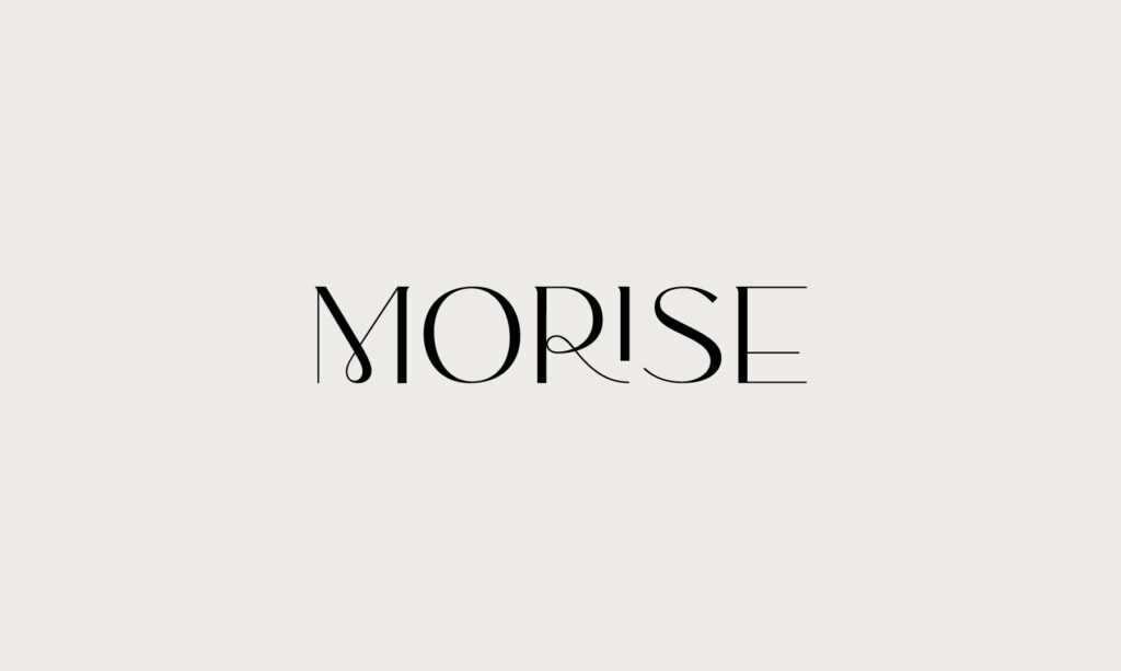
Morise. Has some fun, quirky loops. Very trendy right now.
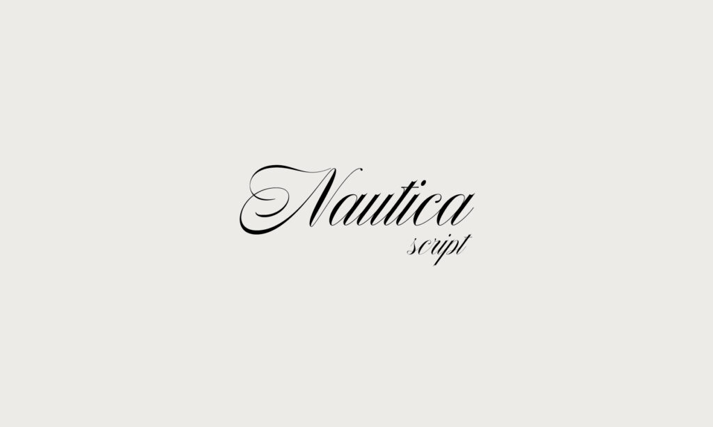
I tend to use script fonts very sparingly. Nautica is an excellent choice for a logo or accent font. It feels luxurious and expensive, like a fancy dark chocolate or bottle of wine. Pairs well with a classic all-caps serif typeface like Cormorant or Made Sonara.
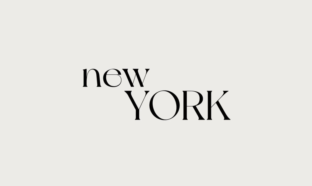
I love New York. The all-caps is very clean, where the lower-case version has some quirky, wispy bits. It radiates cool.
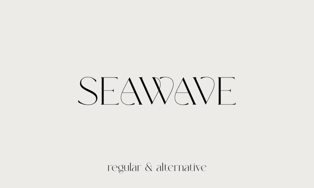
Seawave regular & alternative. In love with this delicate, flowy serif typeface. It’s feminine and modern. It’s quirky rounded edges break the rules of most straight-edged serif fonts in such a stylish way.
©2025 CALMCONTENT
